We Always try to Create a difference
Please don’t forget to follow me and to rate this awesome menu.
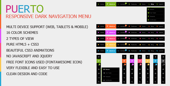
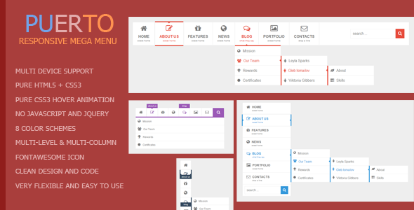
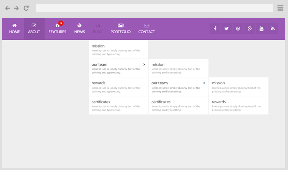
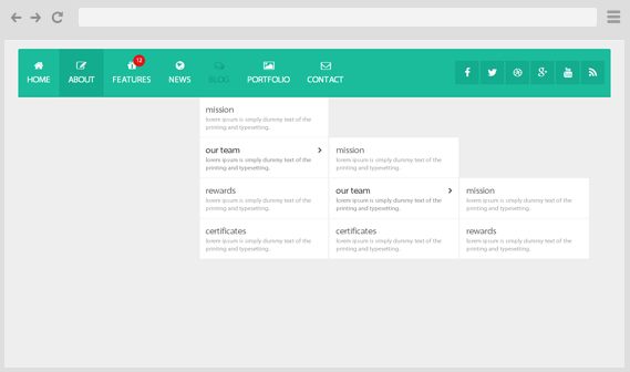
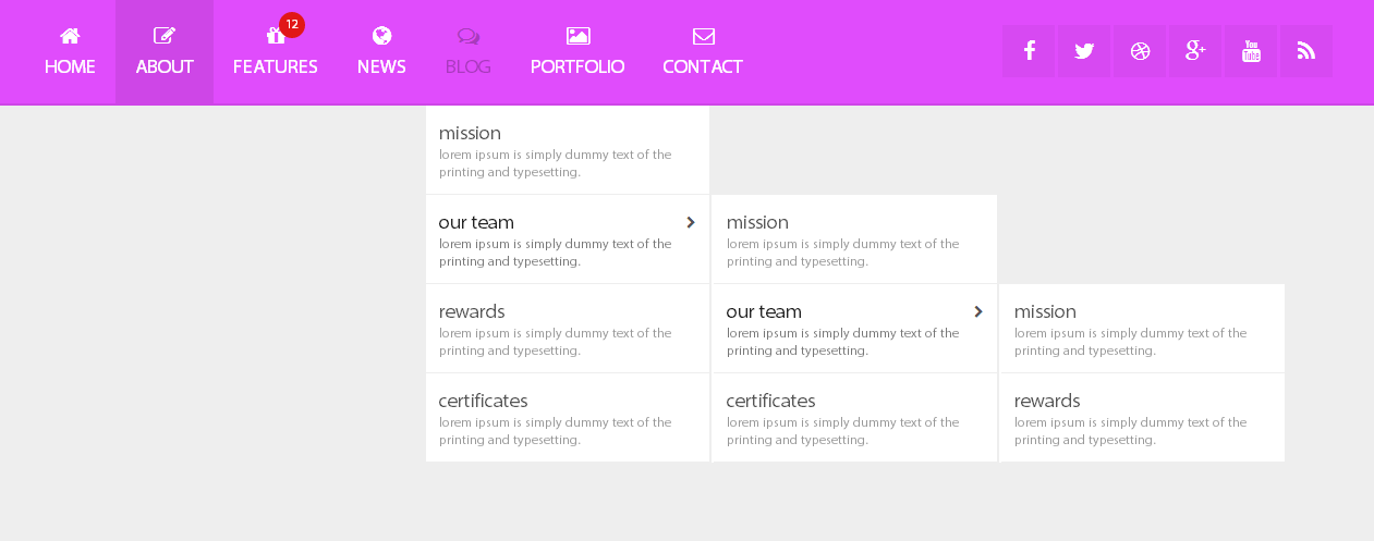
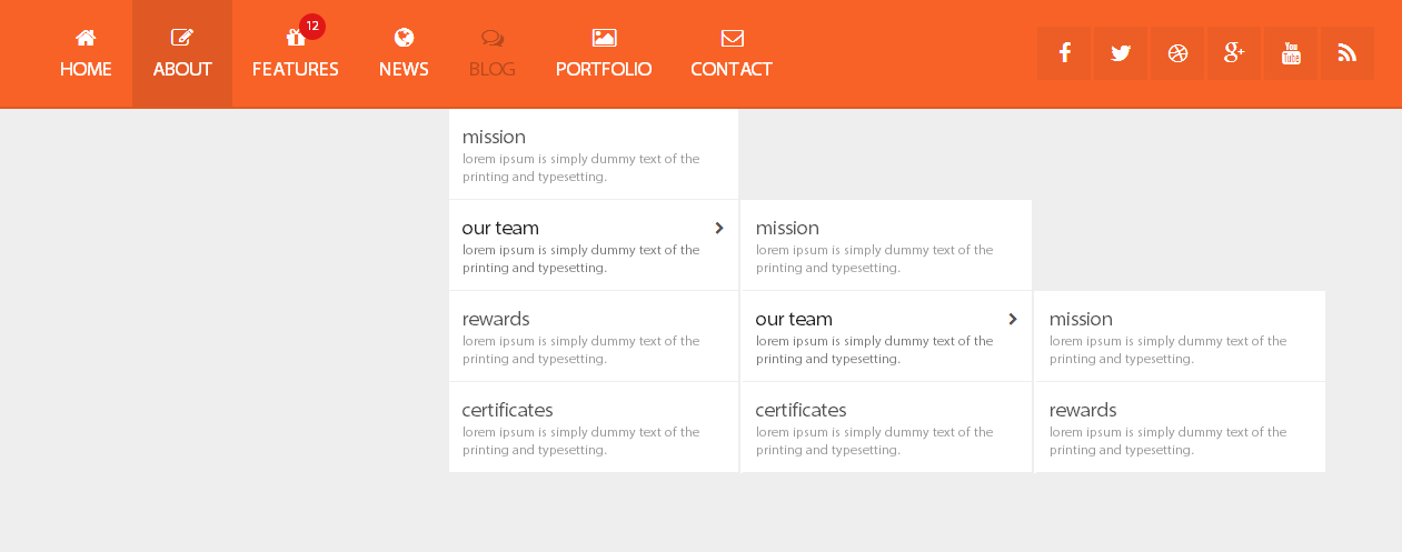
Purchase NowPuerto – Responsive Mega Drop Down menu: is pure HTML5/CSS3 menu. Menu has HTML5 structure and works on all major browsers. Menu is easy to edit and integrate into any website. CSS is separate from HTML and is well commented. Menu has 3 similar layout and 14 colors, each theme can be used separately without any connection with the others. Menu is responsible and adapts to the screen of the device(computer monitor, tablet, mobile phone…). Menu also has 4 different animation.
Menu works (the main structure is 100% same) on Internet Explorer 9, 8, 7… and a lot of old browsers but animation and some other CSS3 features do not work
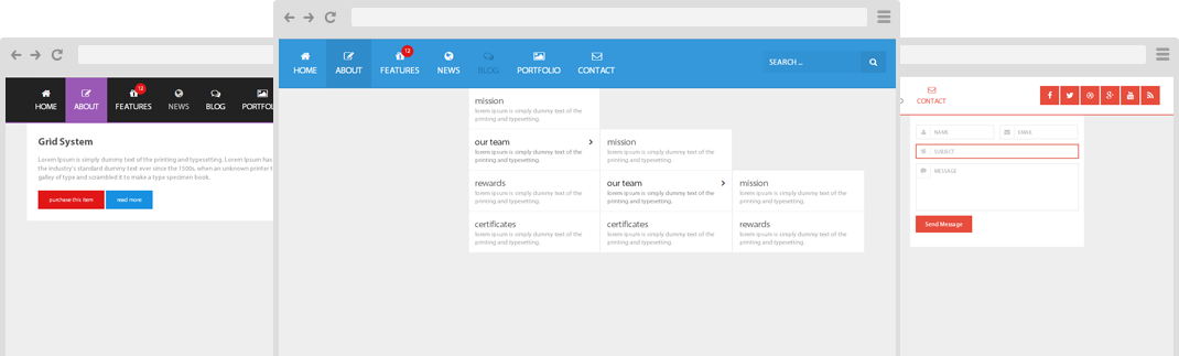
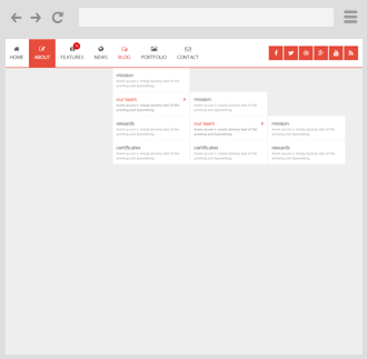
Responsive layout that adapts perfectly for all device resolutions: mobiles, tablets...
There are 2 animation effects based on pure CSS3: flipInY, bounceInUp...
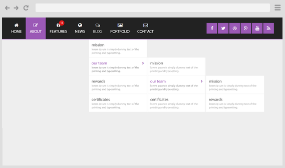
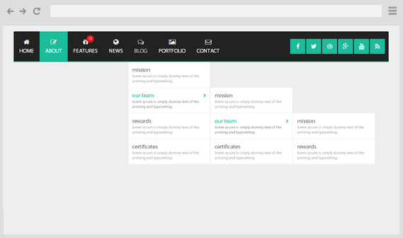
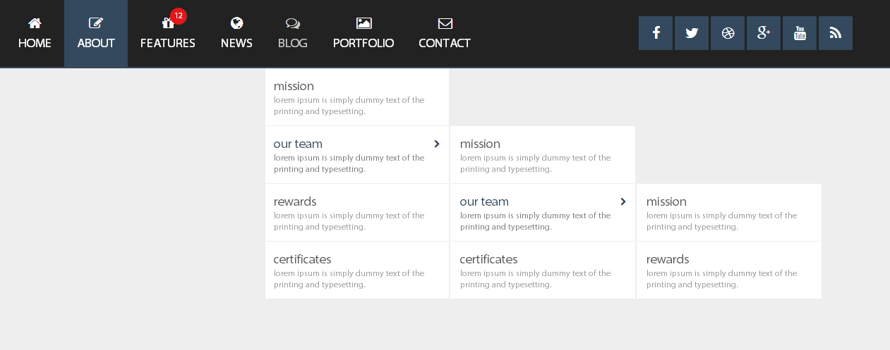
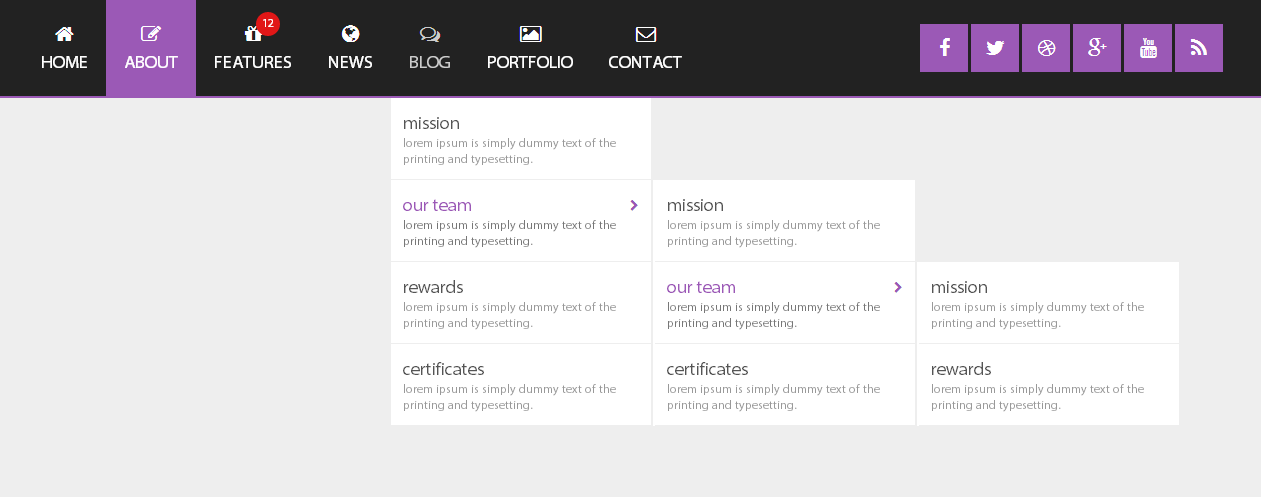
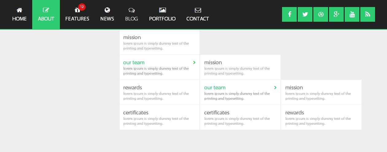
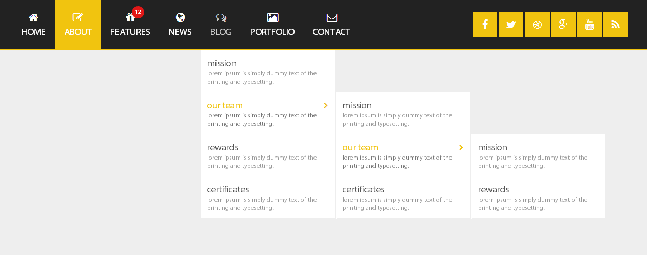
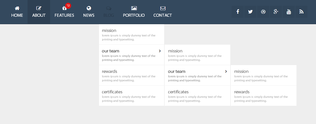
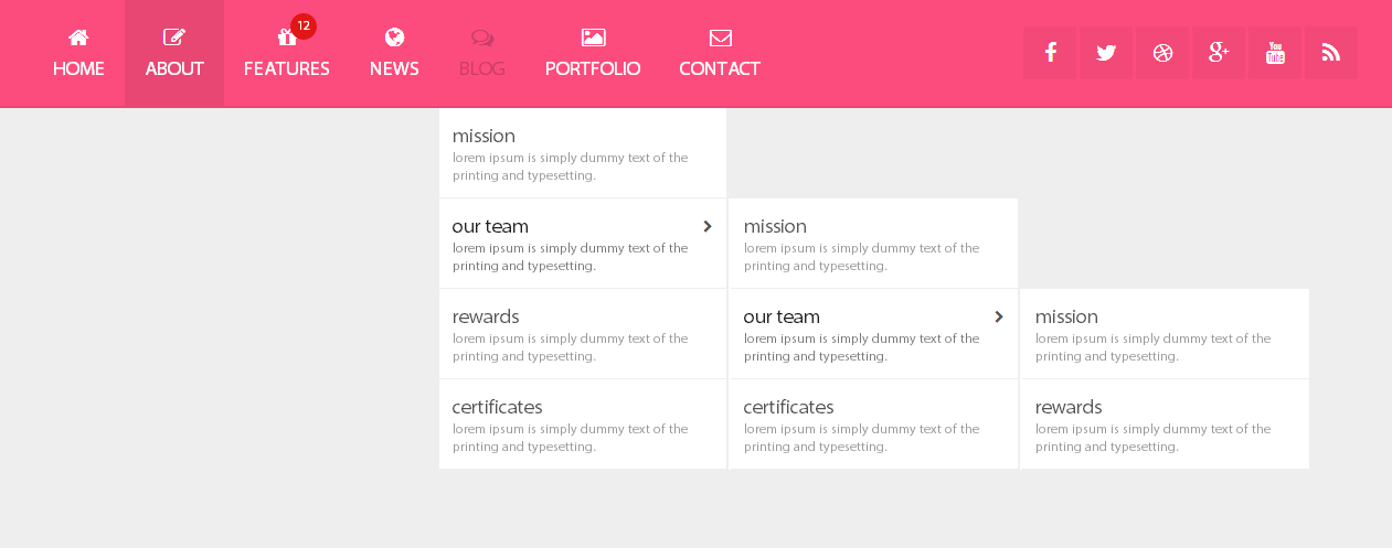
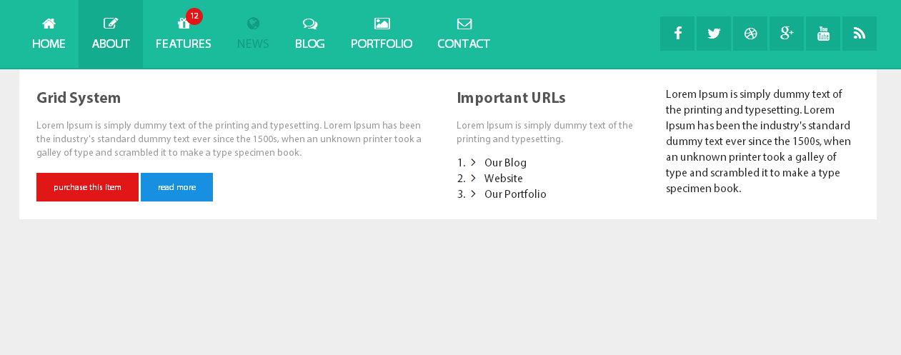
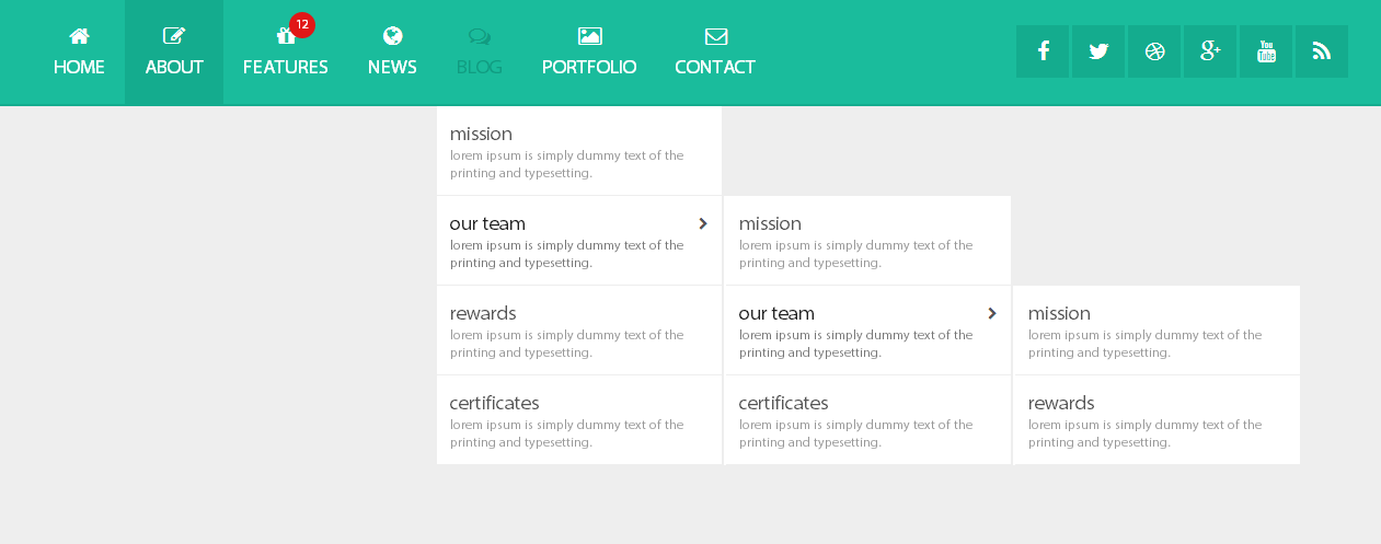
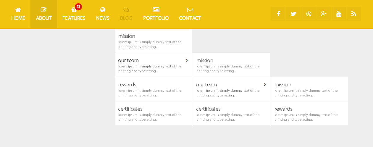
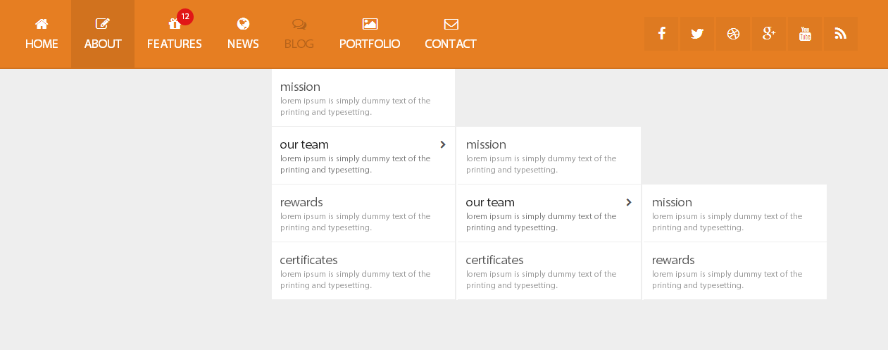
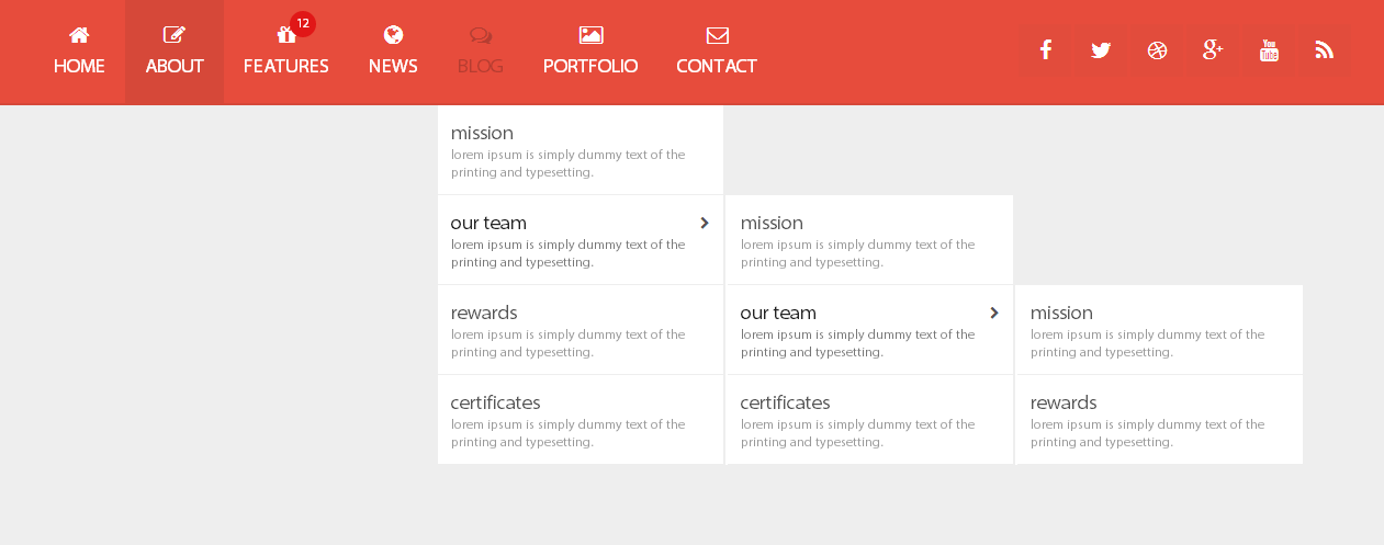
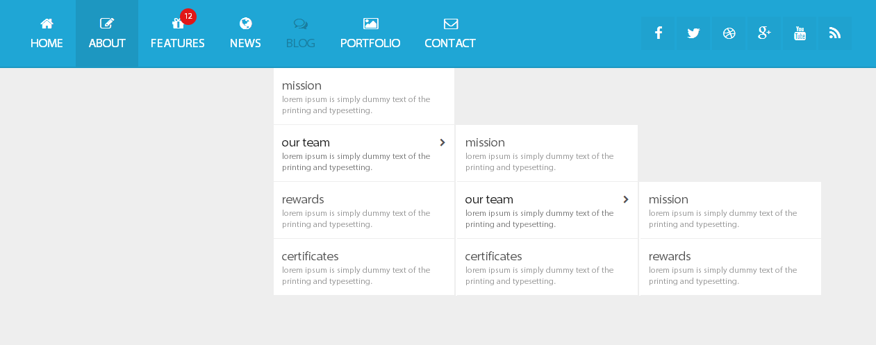
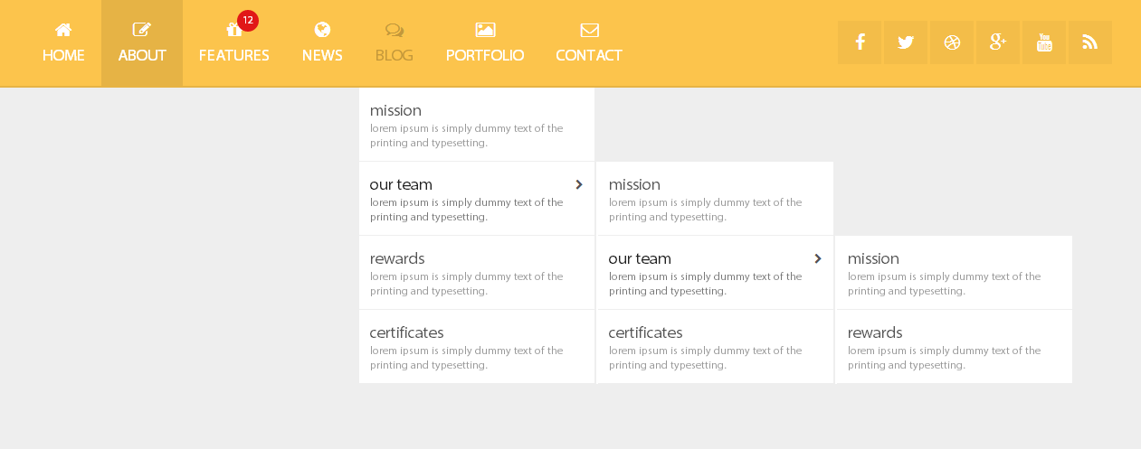
There are 14 color, and you can modifie it easily for creation your own colors.
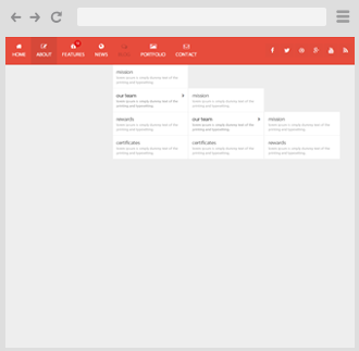
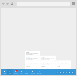
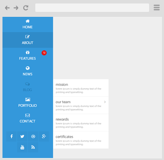
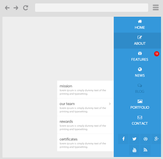
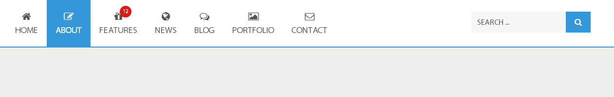
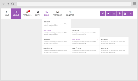
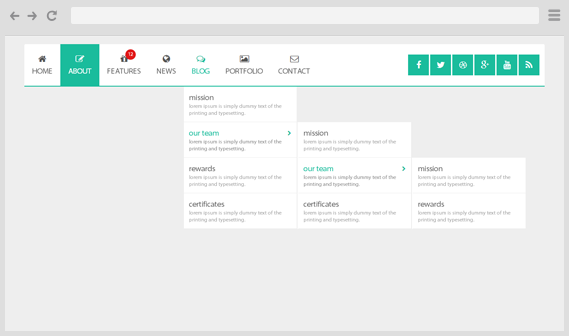
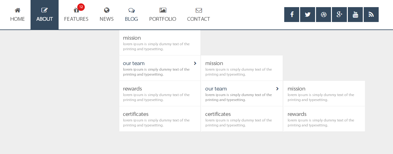
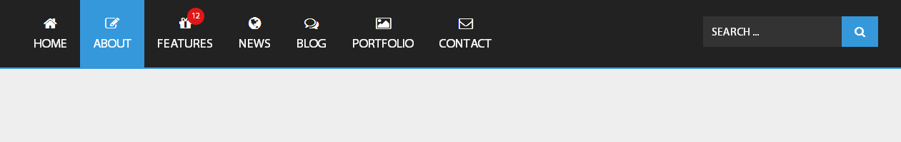
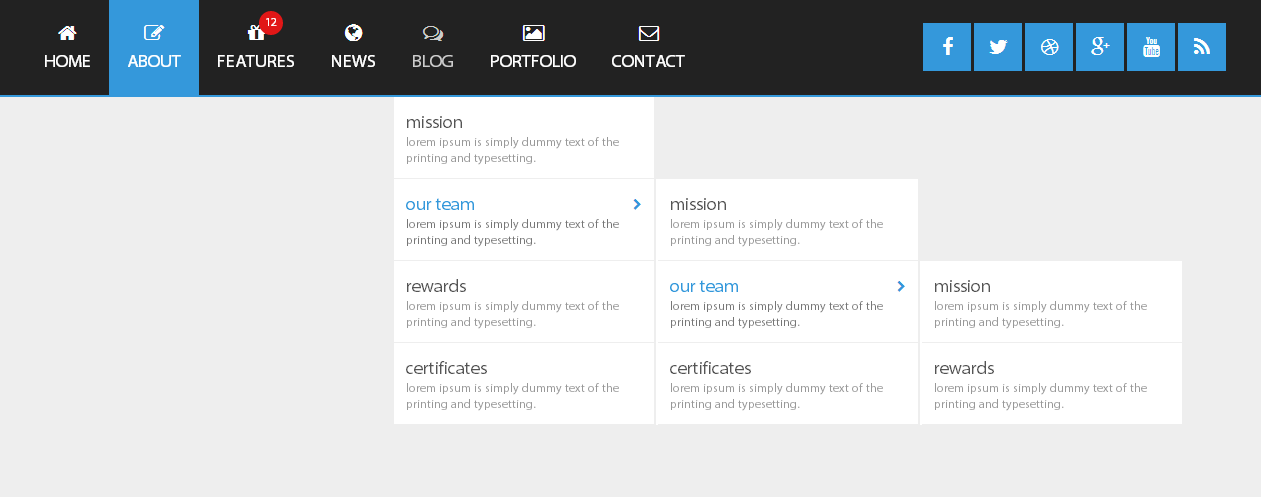
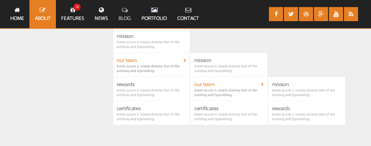
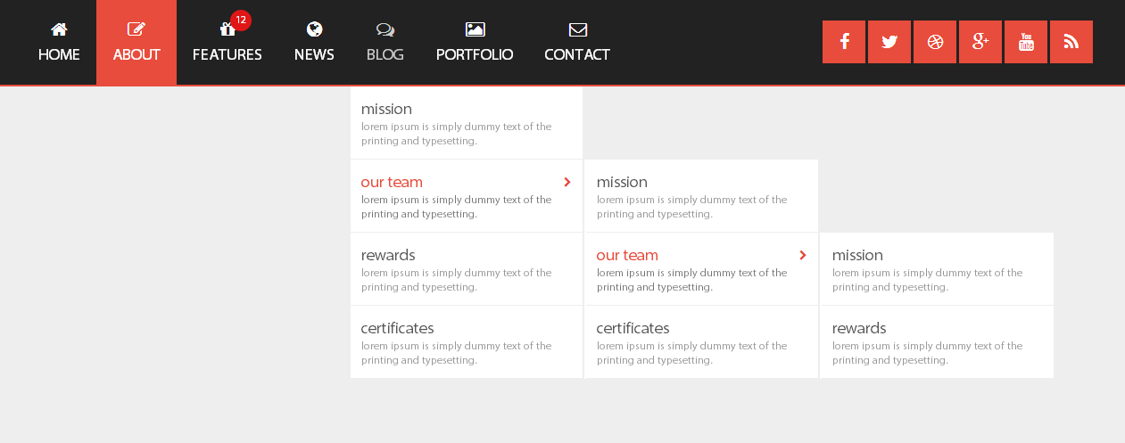
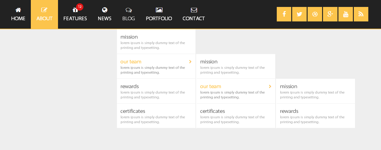
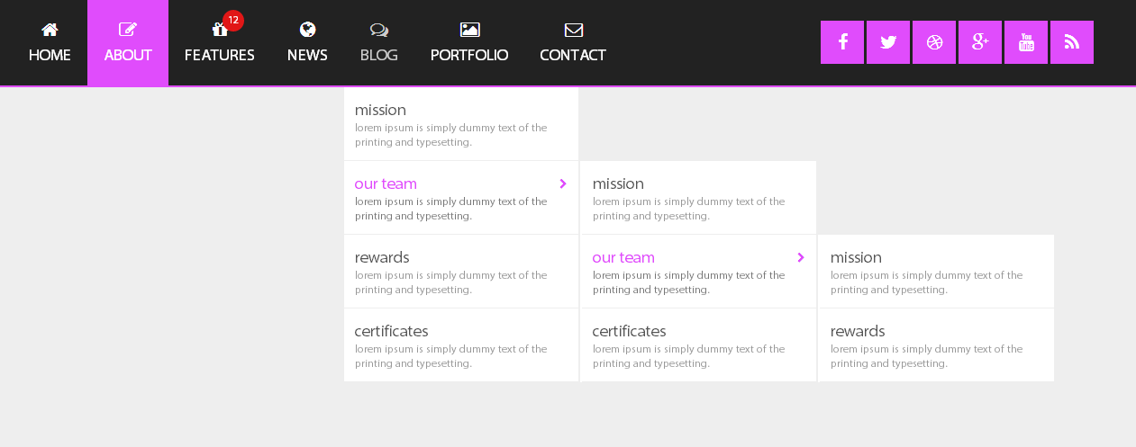
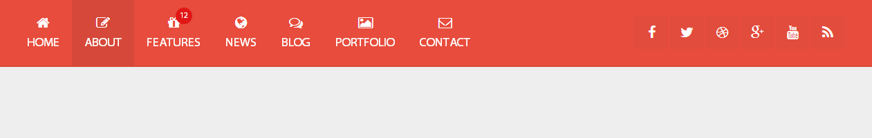
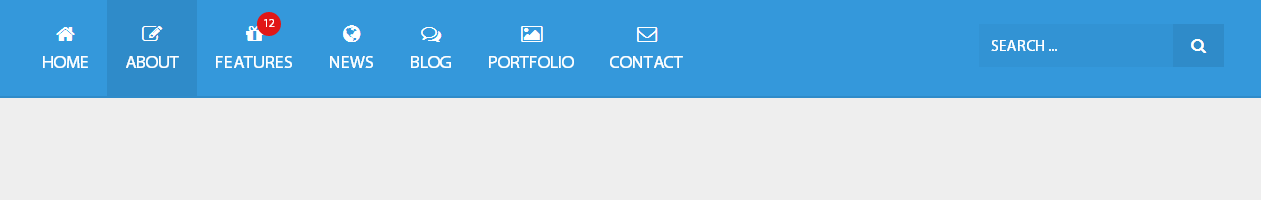
You can choose most suitable color version for you: white, dark or colorful.
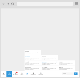
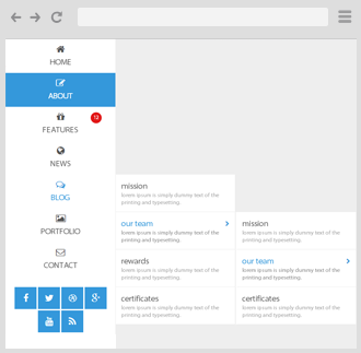
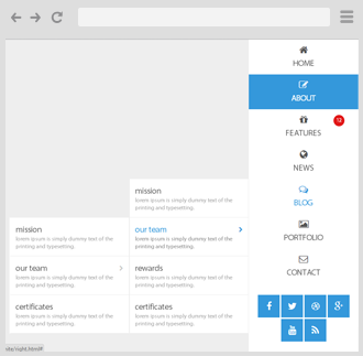
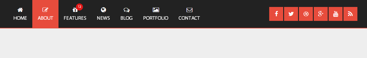
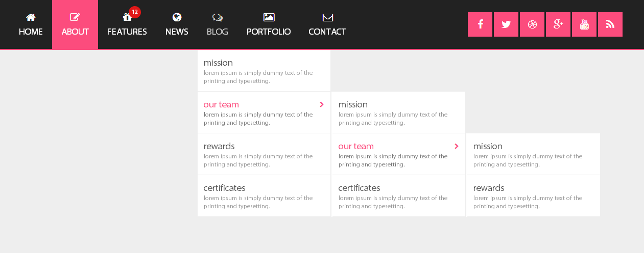
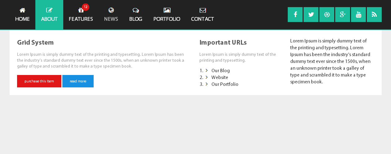
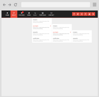
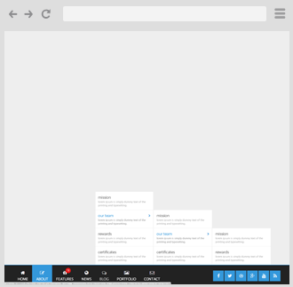
Puerto Responsive Mega Drop Down Menu Can be positioned at any side of the screen.
You can use these examples as a base for creation your own navigations simple and fast.
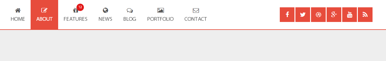
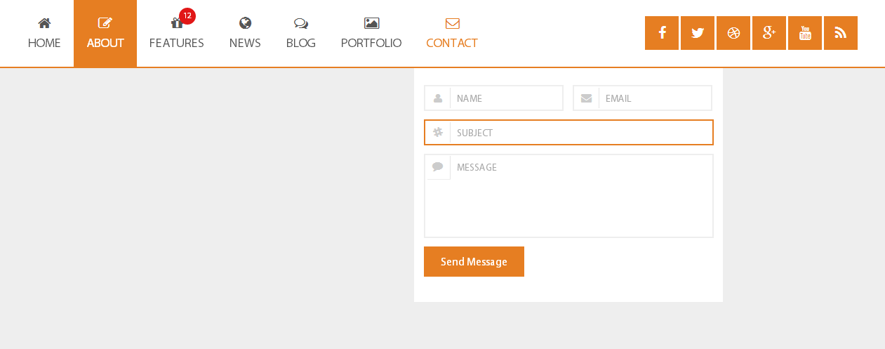
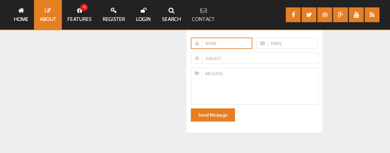
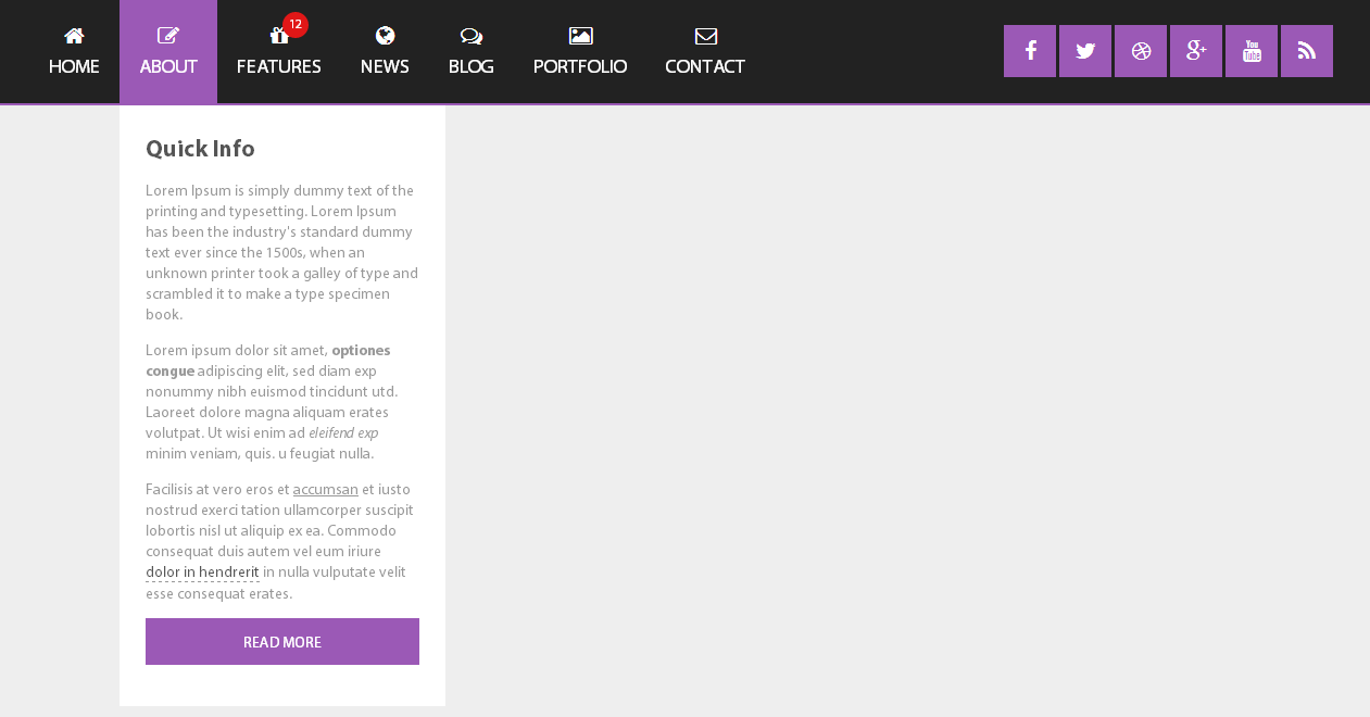
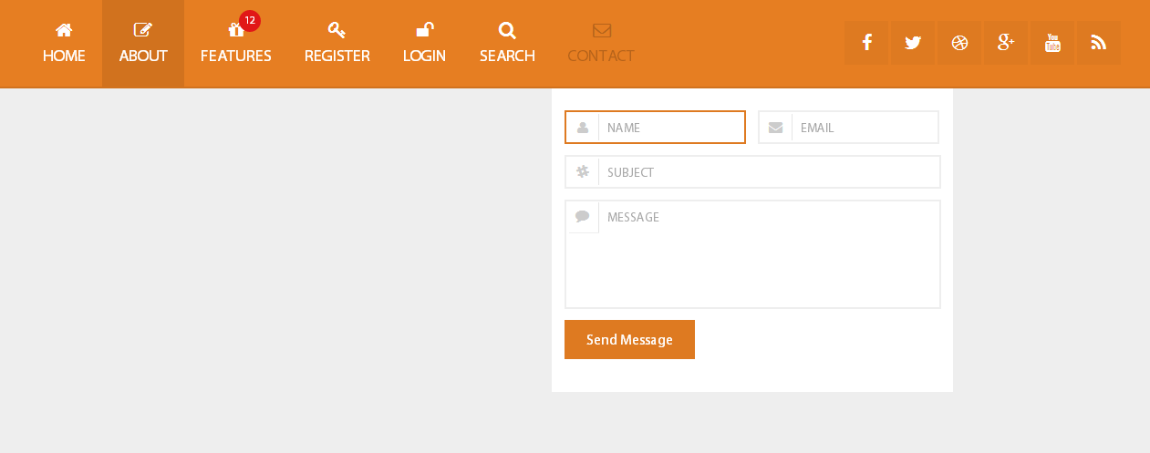
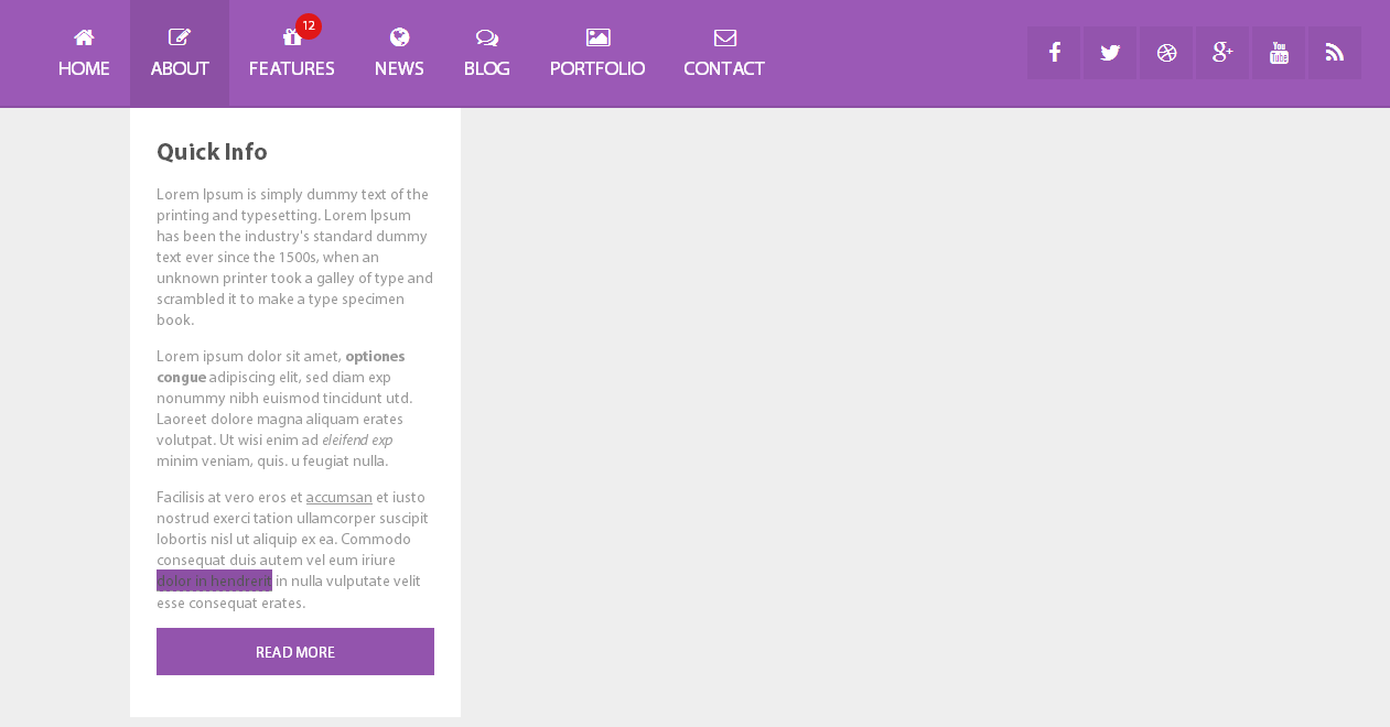
Includes beautiful and responsive html forms like: search, contacts, login and register.
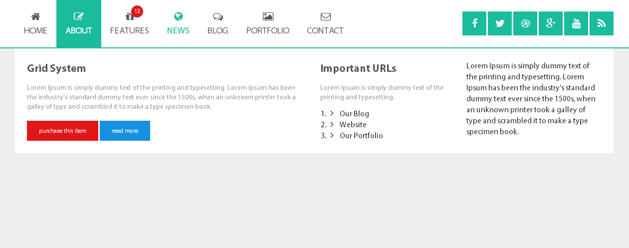
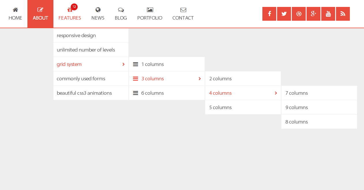
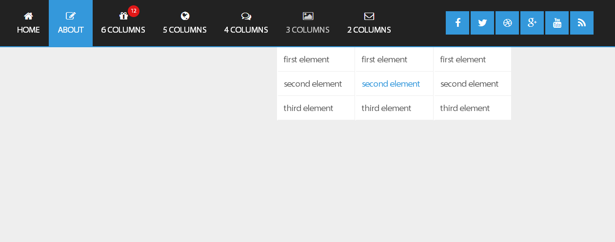
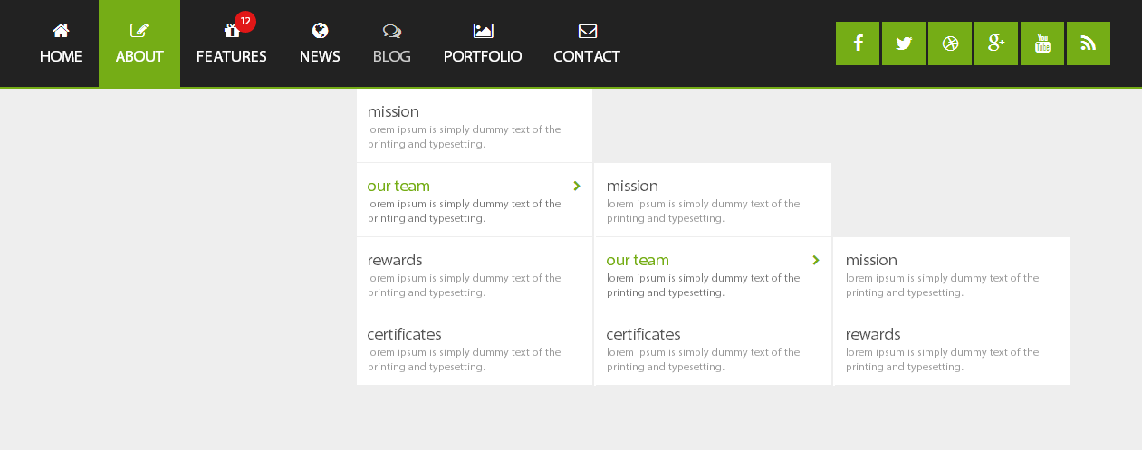
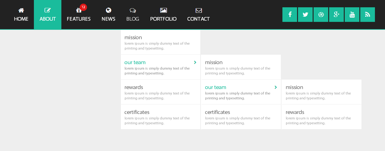
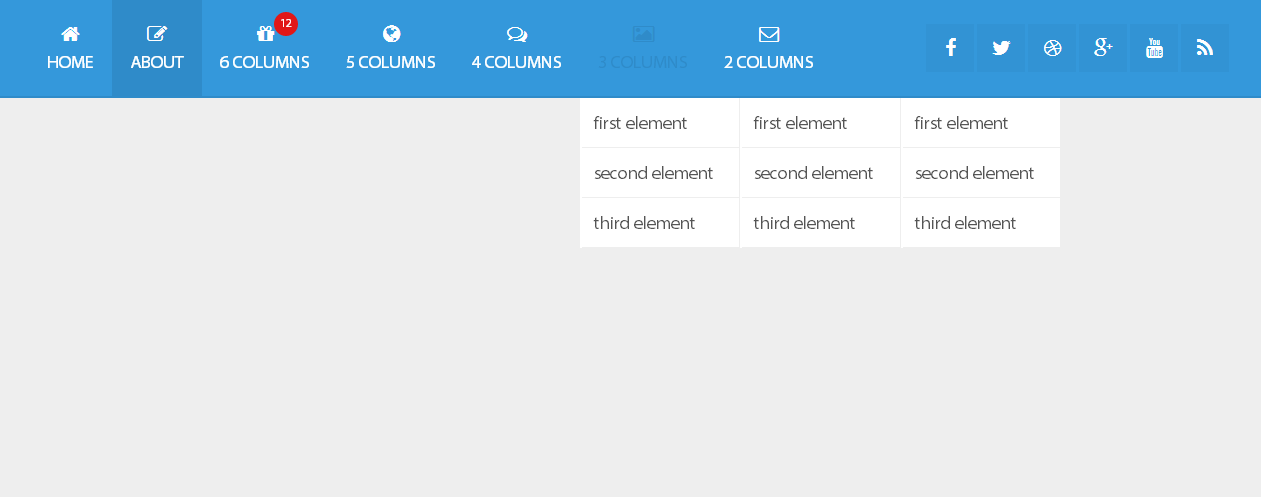
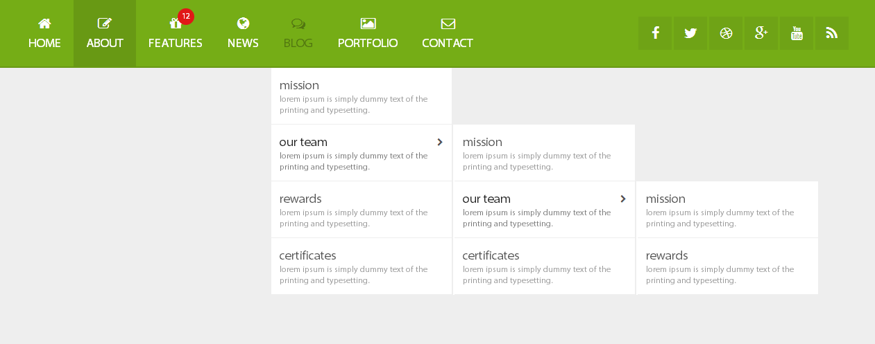
The grid system utilizes 6 columns and adapts to your viewport. Below 767px viewports, the columns stack vertically.
Take full advantage of modern web technologies. Semantic HTML markup and standards compliant CSS.
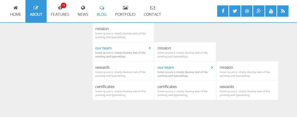
You can choose version with search form or social icons, full Layout or boxed.
There are 2 animation effects based on pure CSS3: flipInY, bounceInUp.


All these demos included to the pack and you can use them as a base for creation your own navigations..
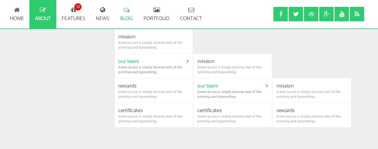
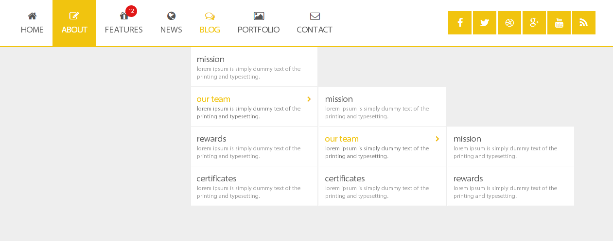
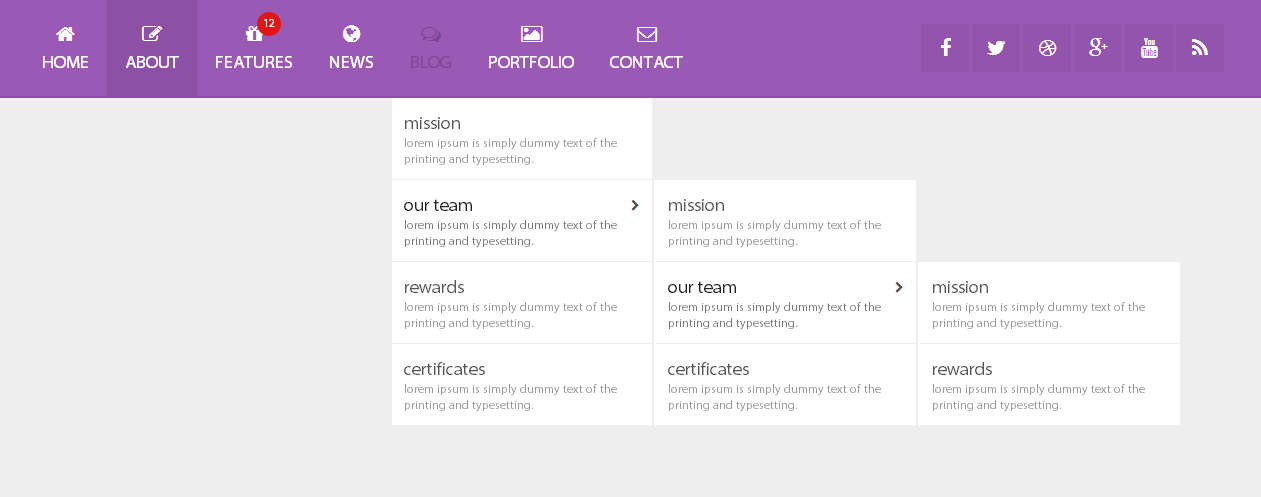
There are 14 color, and you can modifie it easily for creation your own colors.


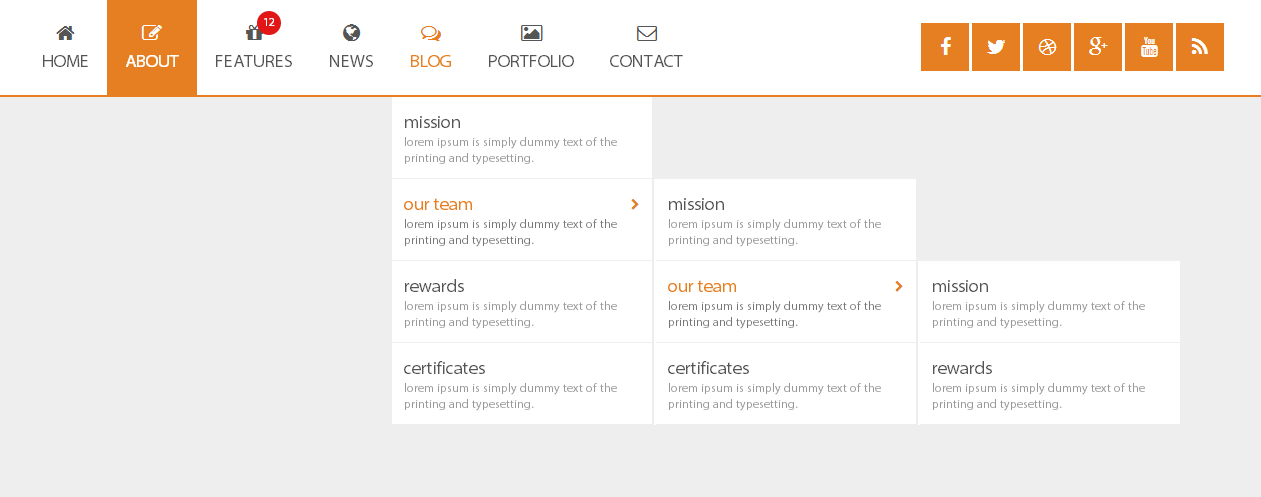


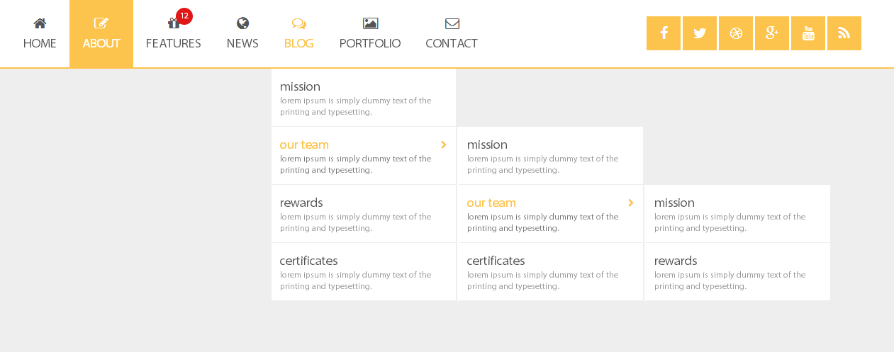
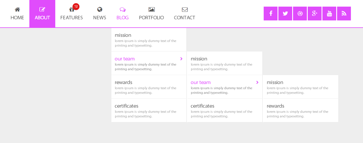

Menu can be positioned at any side of the screen.
You can choose version with search form or social icons, full Layout or boxed.
There are 2 animation effects based on pure CSS3: flipInY, bounceInUp.
All these demos included to the pack and you can use them as a base for creation your own navigations..
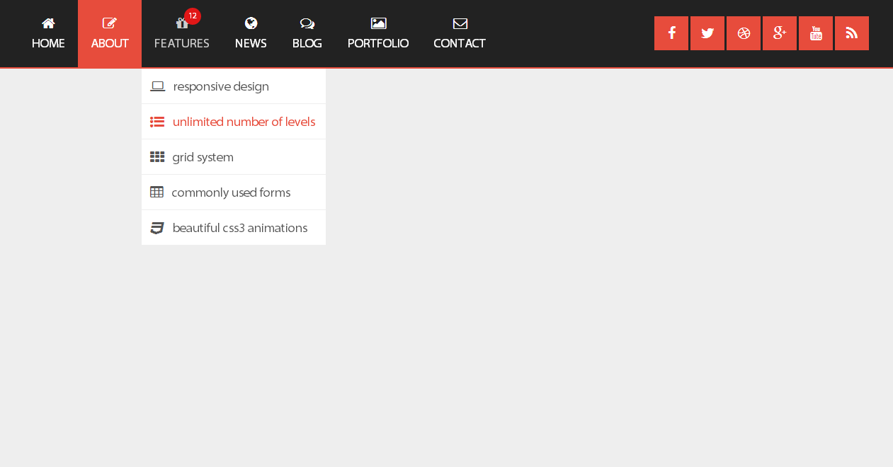
There are 14 color, and you can modifie it easily for creation your own colors.


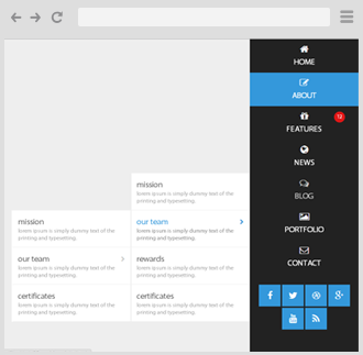
Menu can be positioned at any side of the screen.
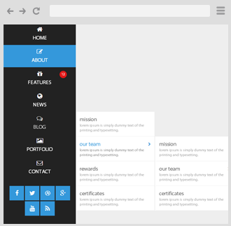
You can choose version with search form or social icons, full Layout or boxed.
There are 2 animation effects based on pure CSS3: flipInY, bounceInUp.
All these demos included to the pack and you can use them as a base for creation your own navigations..
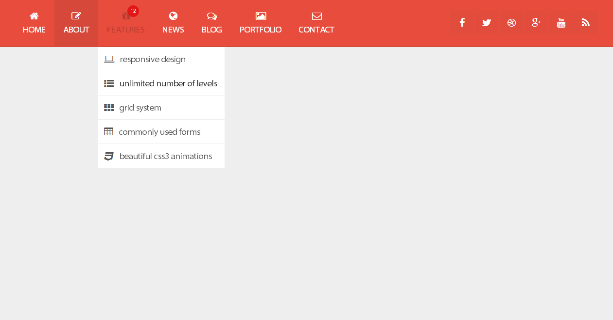
There are 14 color, and you can modifie it easily for creation your own colors.

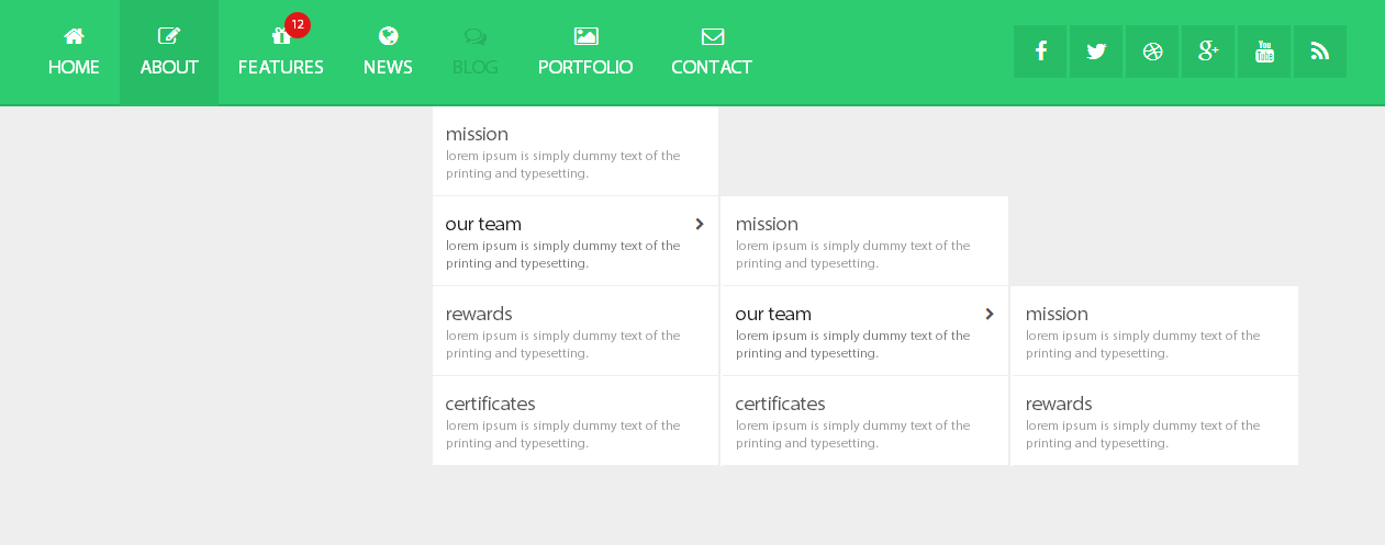
Menu can be positioned at any side of the screen.